WEB SITES > NorwoodSashandDoor.com
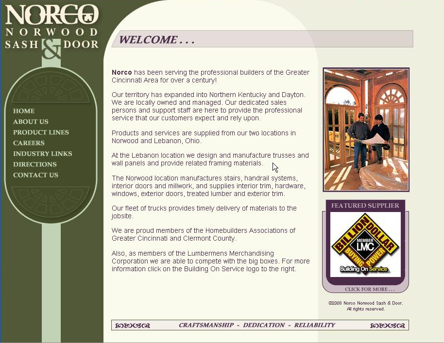
This was a referral client that I really enjoyed working with ... until the recession caused sales to nosedive and they were forced to severely cut budgets and eventually closed. At the time I got to the site, it was pretty basic, boxy, lifeless and gray, so I gave it a newer, more refined look. They really like the curves and nods to the archway in the site's new navigation.
What you cannot see in this flat screen grab are the navigation transitions, the "Featured Supplier" box was coded to display a random supplier at each load and each subpage had an elegant header. The design also expanded vertially and horizontally as content - or the browser - expanded - offering a "responsive design" years before it became common and easier to code.
What you cannot see in this flat screen grab are the navigation transitions, the "Featured Supplier" box was coded to display a random supplier at each load and each subpage had an elegant header. The design also expanded vertially and horizontally as content - or the browser - expanded - offering a "responsive design" years before it became common and easier to code.