Logos & More > Chocizza
I had worked on this client's website (which you can see by clicking on this ol' hot link), initially only updating the ecommerce section. She asked if I had any recommendations to make it
look more professional and work better with the e-commerce solution she had purchased. I redesigned the entire site including the logo.
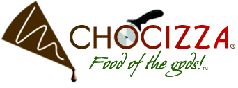
I wanted to drive home the chocolate theme and the pizza shape, so I turned her hard gray triangle into a tasty chocolate slice with a curved top and dripping chocolate. The white chocolate drizzle, which was on pretty much all of her products, was even more pronounced on this new slice. I used a pizza cutter in the name to further drive home the idea of a chocolate pizza, and I crafted the text to use both slices and curves. She asked that her slogan be incorporated, so I added it in a nicer font in green, the missing color of the Italian flag.
I wanted to drive home the chocolate theme and the pizza shape, so I turned her hard gray triangle into a tasty chocolate slice with a curved top and dripping chocolate. The white chocolate drizzle, which was on pretty much all of her products, was even more pronounced on this new slice. I used a pizza cutter in the name to further drive home the idea of a chocolate pizza, and I crafted the text to use both slices and curves. She asked that her slogan be incorporated, so I added it in a nicer font in green, the missing color of the Italian flag.
